Thursday, December 27, 2012

Painting Colour Samples


This painting is inspired by the artwork of Tracey Verdugo, Flora Bowley and Donna Downey, three artists who have a very similar style. The reason I am sharing this here is to show you how colour can affect the end result that you are trying to achieve. I have used Photoshop to demonstrate an intention. The painting is the same with a different emphasis on the appearance of the final colour, pushing the painting into different hues, reds, greens, purples,blues etc.
 

This looks like a texture but in fact it is just a photoshop manipulation :o)
Posted by Picasa

Colour Colour and more Colour

I thought I would share what I have been doing in the past two days... yup... two days! People have often commented on the colours I use in my paintings and journals, something I think I take for granted, but I also get stuck sometimes. I have a colour palette that I use most of the time but every now and again I want to try something different.
When I am doing a painting, I NEVER use colour straight out of the tube, I always mix my own. If for example I want to use a cadmium yellow, rather than use it straight from the tube I will mix my reds into a lemon yellow until I get the golden yellow I want to use. I never use primary colours either and I like to mix all my own greens, I don't know why but I just enjoy the journey and often end up with colours that I wouldn't be able to duplicate again :o)
I had a whole lot of paint swatches and decided yesterday to make my own colour wheel and samples of colour palettes that I really enjoy working with. I hope you can get something out of me sharing this with you.


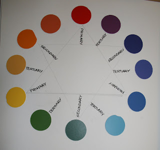
Cutting all the paint swatches into circles, make up a colour wheel using Primary, Secondary and Tertiary colours.

On a second colour wheel, add the analogous colours, which is the colour on either side of an existing colour, which gives you more shades from yellow to red, from red to blue and from blue to yellow. For example you have more choice of yellows and oranges, reds and purples, blues and turquoise greens.
An analogous colour can be any two colours on either side of a colour, where as the intermediate colours are two colours either side of a primary colour.

Normally what I do when I see a picture or painting that I like the palette of colours, I will cut the picture out of the magazine or if I see it on the internet I will use my Prisma colour pencils and make a sample of the colours in one of my journals. These are just some of them. In the sample below, the palette of colours on the right is Red, Olive and Forrest Green, but the little sample of Apple Green can be added in small quantities to give the highlights. Oh and that's another thing, I try not to use pure white or black in my paintings unless I absolutely have to. My black is more often than not a very dark burgundy and my whites always have a touch of yellow, blue, or lilac. I will talk about Grey in just a moment.

Examples of three pictures cut out from magazines and the colour palette next to it.


We all know about Warm, yellows oranges, rust  and Cold colours, pinks, blues and purples, but you can also have a cold orange by adding a little magenta or one could have a warm mauve by adding a little yellow. So be aware of what results you want to achieve, cool or warm?

Samples of colour palettes cut out of books and magazines. Colours that work well together are your primary colours used alongside the opposite complimentary colours, for example Red and green, Blue and orange, yellow and purple.

This is my own colour wheel. Although introducing the green as a complimentary colour it gives me the various shades of green and turquoise, so when I am working I work from this colour sample.
The reds and oranges are called Monochromatic colours which in themselves work well in artwork but adding a touch of a complimentary colour really brings things to life.

After I made the colour wheel with the Paint swatches I then tried to match up the same colours using paints. You can see from the Orange around to the purple it is very difficult to see the difference between the colours. Changing the Primary colours a shade or two will alter your oranges and your purples considerably.
Have you ever become really annoyed when you are painting and your colours seem to get muddy! well you can see from the sample of water ... that's what happens when you mix all the colours. So if your painting is becoming muddy your colours are becoming contaminated. Try to stick to 3 colours when mixing a 4th colour and it will help to keep your colours pure. Also keep your water or your turps clean.

When I finished playing with all these colours I took my paintbrush and mixed all these colours together on the plate I was using and as you can see... you get that nice dirty muck, which is NOT grey, it is mud.
Grey shadows are reflections of objects at different times during the day depending on the light and the season. I learned something very interesting many years ago when I did an art class. I was told that in the desert, the shadows are cool which makes the oranges and warmth of the sand look even warmer and in the snow the shadows can be made warmer it makes the snow look even colder. Of course we know that painting whites, in wedding dresses, or in snow etc there will be shades of lilac and blue greys, but adding a warmer grey it will make your whites look even whiter.

Keep watching for a discussion on Grey...that bland colour that can look so beautiful.

Well that is your colour lesson for today. ;o)
Posted by Picasa

Wednesday, December 12, 2012

Sharing is Caring

I am sharing this on more than one of my blogs I thought it was so cute. Alisa Burke is an incredible artist and always makes the amazing recycled artwork. Go to this link where you can down load her FREEBIE labels. Go over to her blog, scroll down and the link is there to Alisa's Flickr account where you can down load a larger file. Love all the bright colours.

Sunday, December 9, 2012

Pages from Eezy Peezy Journals


Sharing some sample pages from an Eezy Peezy Journal.
Posted by Picasa

Friday, November 30, 2012

What A Bargain


SPECIAL OFFER  ONLY UNTIL THE END OF JANUARY 2013
SPOIL YOUR SELF.
R245 excluding postage.
(Discount is only available in South Africa)
Contact : carylw3@mweb.co.za
Posted by Picasa

Friday, November 16, 2012

10 Rules to being creative

Sometimes we just need a gentle reminder to have fun and forget about the rules of life and pay attention to the rules of being creative. It has always troubled me that when we were younger we all wanted to grow up way too fast. When we became adults all we want to do is play like we did when we were kids. We are often told to grow up, be mature, take responsibility and then we spend money on doing courses that help us to reconnect with our inner child... it is all way too complicated for me. Enjoy the video it's just fun.

Happy Friday

Tuesday, November 6, 2012

Featured Artist

Wow, what an absolute treat. I have been the 'featured artist' this week 3 times... how awesome is that. Please pop over for a visit to the wonderful blogs of the people who have been so kind to show case my art work. Sandy. JenniBellie  Monica.

You will not only see the interviews about my own art work if you scroll down on their pages, but you will also be able to see some of their art work and browse around to see the wonderful work they do. Fun Fun Fun.

Wednesday, October 31, 2012

Funky Flowers


This is all Jenni's fault. Don't forget to go and have a look at her blog, the link is below.
 

Washi tape is big news overseas and quite hard to get here in SA although there are a few places who stock it. This is my versian. Several years ago I did a class with Teesha Moore another fantastic artist and this was how I made my borders for my journal pages. I loved the idea and have used 'my version' in quite a few other projects including my Smash Trash Journals.
 
Posted by Picasa

Eezy Peezy Journals


HERE AT LAST.
SHOULD YOU WISH TO BUY ONE OF THESE JOURNALS
R295 excluding postage

 
PLEASE EMAIL ME AT
carylw3@mweb.co.za


$36.00 INCLUDING POSTAGE 


Posted by Picasa

Artist Interview

For all you Beautiful, Talented, Creative, Inspiring, Soulful, artists out there please pop over to Jennibellie's blog not only to read the artist interview about liddle ol me, but also spend some time browsing her blog and watching some of her incredible video's. If Jenni published a book I would be one of the first to buy it, she really is one very talented artist.

The link the Artist Interview is here.

Tuesday, October 30, 2012

Eezy Peezy Journals


Packaging is complete and I will be posting pictures in the next day or two. Wow finally after almost a year it is finally here.
Posted by Picasa

Bella Blu


In case you are wondering why she became pink.... well this is Bella when she was a puppy and nearly got lost on a beach in Cape Town... trying to chase a sea gull... I couldn't see her, so the minute I got home I made her pink and she has been on and off again pink ever since.
 
Posted by Picasa

Bella Blu

Bella has been bugging me to say hello, so I thought I would quickly post a few photo's. This is Bella having a bad hair day. Her name is Bella Blu but she likes being pink.


and this is Madam Bella'... adored and precious child. Now that all mine have left home, she has taken over and I love her more than anything in the world... including my art.

This is Bella taking life very seriously, she is very into spiritual things and this is one of her favourite books.

I will post more photos now and again just to keep her happy.
Posted by Picasa

Sunday, October 28, 2012

Cute Funky Flowers


What an amazing artist Jennibellie really is. She has so many wonderful recycling ideas you just have to go and see all her incredible video's.

Friday, October 26, 2012

My Rubber Stamps


To order any of these stamps you can order them from Queen Kat Design Stamps.
These stamps are copyright to Queen Kat Design Stamps so please do not copy or reproduce them.
Posted by Picasa